Before becoming a designer, something as simple as product packaging would have never caught my eye. But now, I am constantly paying attention to any sort of logo or product design. Over the weekend, I went out to buy a new Burt’s Bees chapstick, as it is the season of dry lips.
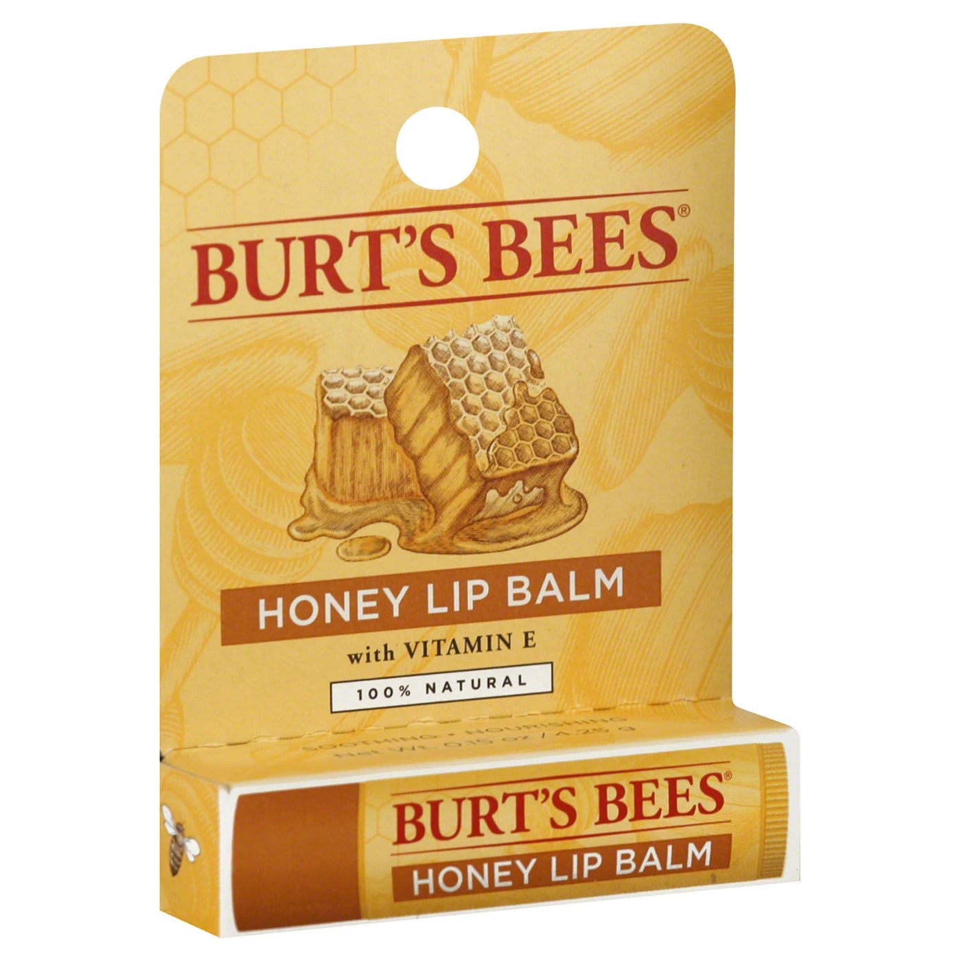
I was really impressed with the overall display of this packaging. I like how all the colors and fonts used feel unified. This design is quite simple, including just one image, but I find it extremely well-organized and visually appealing. I find myself constantly finding design inspiration everywhere that I go!
Hi, this is a comment. To get started with moderating, editing, and deleting comments, please visit the Comments screen in…